
How to Choose Interior Paint Colors That Flow Room to Room
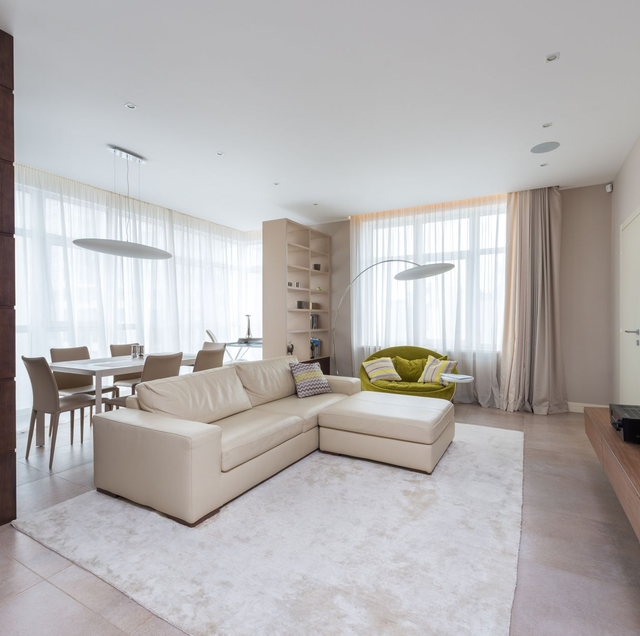
Quick Answer: Pick interior colors for the whole home first, not one room at a time. Start with a neutral base that runs through halls and open sightlines, add two or three coordinating accents, and check that every color shares a compatible undertone. Then test large samples on real walls in morning and evening light before you buy a single gallon.
Most color regret starts the same way. You fall for one wall color in one room, paint it, love it, then pick the next room on its own, and the next, until you walk down the hall and something feels off. The rooms fight instead of relating. A home reads as one place, and the eye takes in more than a single wall at a time. Through an open doorway you see two rooms at once. From the hallway you catch three. Choosing color room by room ignores those sightlines, which is exactly where a palette either holds together or falls apart.
The fix is to plan the whole home as one palette before you commit to any single room. That does not mean every wall is the same color. It means every color you use belongs to the same family and takes cues from the same fixed elements. Here is a practical method for getting there.
Start With a Whole-Home Palette
Think of a palette the way a wardrobe works: a few neutral basics that go with everything, plus a handful of accent pieces that add personality without clashing. Your home needs the same structure.
Begin with a neutral base, the backbone color that carries through connecting spaces such as hallways, stairwells, and open-plan areas where rooms flow into one another. This is usually a soft white, greige, warm gray, or muted tan. Because it appears in the spaces that tie the home together, the base does the heavy lifting for cohesion.
Then choose two or three coordinating accent colors for individual rooms. These can be deeper, moodier, or more saturated versions that share a relationship with the base. A bedroom might take a soft sage, a study a deep navy, a powder room a clay terracotta, all sitting comfortably against the same backbone neutral. Limiting yourself to a small set keeps the home from turning into a patchwork.
The test is simple: stand in any spot where you can see two spaces at once and ask whether the colors look like the same person chose them. If they do, the palette is working.
Understand Undertones Before Anything Else
Undertones are the single most common reason a color choice goes wrong, and the hardest thing to see until it is on the wall. Every neutral has a hidden bias underneath its surface. A "gray" can lean blue, green, or purple. A "white" can pull yellow, pink, or gray. A "beige" can read pink or green depending on what is next to it.
Colors also fall into warm and cool families. Warm undertones carry yellow, red, or orange; cool undertones carry blue, green, or purple. The clash happens when you place a cool-gray wall next to a warm-cream trim, or a pink-beige next to a green-gray. Nothing is technically wrong with either color, but together they look muddy or slightly dirty, and most people cannot name why.
To spot an undertone, hold the sample next to a true white sheet of paper. Against pure white, the bias jumps out, so a gray suddenly looks distinctly blue or a white looks clearly yellow. Do this for every color in your palette and confirm they all lean the same direction.
Use the 60-30-10 Rule
Interior designers lean on a simple ratio to balance a room, and it scales to a whole home. The idea splits any space into three proportions:
- 60 percent dominant. The main color, usually your base neutral on the walls.
- 30 percent secondary. A supporting color across larger furnishings, cabinetry, or an accent wall.
- 10 percent accent. The boldest color, used sparingly in smaller doses such as a door, built-ins, or décor.
The ratio keeps a room from feeling flat (all one color) or chaotic (too many competing colors at equal strength). Applied across the home, the dominant color stays consistent while the 30 and 10 shift from room to room, which is what lets each space have its own character while still belonging to the set.
Read the Light Before You Trust a Color
Paint has no fixed color. It only reflects whatever light hits it, so the same gallon looks different depending on the light in each room and the time of day.
Natural light changes through the day: North-facing rooms receive cool, indirect light that pushes colors toward gray and can make warm tones look flat. South-facing rooms get strong, warm light most of the day, which intensifies color. East-facing rooms are warm and bright in the morning, cooler by afternoon. West-facing rooms flip that, cool in the morning and warm and golden by evening. A color you sampled at noon can look different at dusk.
Artificial light shifts it again: Bulb color temperature matters as much as the paint. Warm-white bulbs deepen yellows and reds and can make cool grays look dingy. Cool-white or daylight bulbs sharpen blues and greens and can wash out warm tones. Because you live in these rooms after dark, judge every color under the actual bulbs you use, not just in daylight.
The practical move is to test big swatches on more than one wall in a room and look at them in morning light, in flat midday light, and again at night with the lamps on. A color that holds up across all of those is a safe choice.
Sample Properly, Never From the Chip
The tiny paint chip from the store is the least reliable way to judge a color. It is too small to read accurately, and it is usually seen under store lighting against a card of competing swatches.
Instead, use one of two real-world tests:
- Peel-and-stick samples. Large removable color sheets you can move from wall to wall and room to room without painting anything. They are clean, repositionable, and good for comparing several options side by side.
- A large brush-out. Paint a two-foot square directly on the wall, or on a white poster board you can move around. Apply two coats, so you see the true built-up color, not a thin, translucent pass.
View samples against the wall where the color will actually live, next to the trim and flooring it has to work with. Testing before you commit protects more than your patience: a wrong color chosen from a chip means a full room repainted, so the gallons and the labor go to waste. A few sample sheets prevent all of it.
Match Sheen to the Room
Color and sheen are two separate decisions, and sheen changes how a color reads. Higher-gloss finishes reflect more light, which can make a color look brighter and show every wall imperfection. Flatter finishes absorb light, softening the color and hiding flaws.
A rough guide by room:
- Flat or matte: ceilings and low-traffic adult bedrooms, where you want to hide imperfections, and there is little scrubbing.
- Eggshell or satin: living rooms, dining rooms, and hallways, a middle ground that cleans up better than flat.
- Satin or semi-gloss: kitchens, bathrooms, and any high-moisture or high-touch surface that needs regular wiping.
- Semi-gloss or gloss: trim, doors, and cabinets, where durability and a crisp edge matter.
Keeping the sheen logic consistent across the home is part of what makes it flow.
Anchor to the Fixed Elements
The things you are not repainting should drive the things you are. Flooring, countertops, tile, cabinets, and large permanent fixtures each carry their own undertone, and they are far more expensive to change than a wall color. So they lead, and the paint follows.
Pull the undertones out of these anchors first. A warm oak floor and a cream quartz counter push the whole palette warm. A cool gray tile and stainless finishes pull it cool. When wall color agrees with the fixed elements, the room settles; when it fights them, the room feels slightly off no matter how nice the paint color is on its own. Choosing paint to complement the permanent surfaces is nearly always easier than the reverse.
Keep Trim and Ceilings Consistent
One of the quietest tricks for a home that flows is holding the trim and ceiling color steady throughout, even as wall colors change room to room. A single trim white running through the entire home gives the eye a constant reference point, a thread that ties every space to the next.
Ceilings usually go a shade lighter than the walls, or a soft white, to keep rooms feeling open and to let the wall color stand on its own. When trim and ceilings stay consistent, you can be far more adventurous with wall colors, because the shared framework keeps everything reading as one connected home.
Warm vs Cool for Mood and Size
Beyond avoiding clashes, warm and cool tones shape how a room feels and even how big it seems. Warm colors (soft yellows, terracottas, warm whites) feel cozy and inviting and tend to make large or under-used rooms feel more intimate. Cool colors (blues, greens, cool grays) feel calm and restful and can make a small or dim room feel more open and airy.
Match the temperature to the room's purpose. A bedroom or a room you want to feel restful leans cool; a gathering space you want to feel welcoming leans warm. Just keep those choices inside the same overall palette so the shifts feel intentional rather than random.
If the home was built before 1978, the existing paint may contain lead, so test it before sanding or disturbing old layers rather than assuming it is fine. Keep windows open and air moving while you paint, since fumes build up fast in a closed room.
Frequently Asked Questions
A workable range is three to five for the entire home: one base neutral, one trim/ceiling white, and one to three accent colors. Fewer than three can feel monotonous; more than five gets hard to keep coordinated across sightlines. Repeating the same accent in two different rooms is a good way to add cohesion without adding another color.
LRV, or Light Reflectance Value, is a 0-to-100 number on the back of most paper samples that tells you how much light a color bounces back. Zero is absolute black, 100 is pure white. Colors in the 55-to-75 range read as comfortable mid-tone neutrals in most rooms. A low-LRV color in a dim, north-facing room can look almost black once it is up, which is why the number is a useful reality check the chip alone won't give you.
Not necessarily, but the walls that physically connect without a break should carry one color. You can still zone an open floor plan with an accent wall or by shifting color where architecture gives a natural stopping point, such as an inside corner, a change in ceiling height, or a doorway. Splitting a color mid-wall with no break tends to look like a mistake rather than a choice.
Yes, and it is a designer trick worth knowing. Painting trim or built-ins in the same color as the walls but in a semi-gloss instead of a matte creates a tone-on-tone effect: the shift in sheen catches the light differently, giving quiet depth without introducing a second color. It works especially well on paneled walls and cabinetry.
It should. Everything that stays in the room contributes to the color balance, so large sofas, rugs, wood tones, and window coverings are effectively part of your 60-30-10 math. A room can look unbalanced even with a well-chosen wall color if a big piece of furniture introduces a competing undertone the walls never accounted for.
The color itself does not change, but the light and the surrounding surfaces do, so the same paint really does read differently across rooms. To keep it consistent, use it in rooms with similar light exposure and similar fixed-element undertones, and avoid placing it directly against a strongly opposite undertone in an adjacent space. If two rooms with the same color must sit side by side under very different light, matching the trim and flooring between them helps them read as one.
Book a free color consultation with our team — get a whole-home palette that flows and samples tested on your walls before a single gallon is bought. True Coat Painting serves Reno, Sparks, and Carson City. Call (775) 227-0618.
